


Zara Changes Its Logo
Zara has a new logo. The Spanish fashion chain follows in the footsteps of the world’s biggest luxury labels such as Balmain, Celine, and Burberry who took a similar step in recent months.
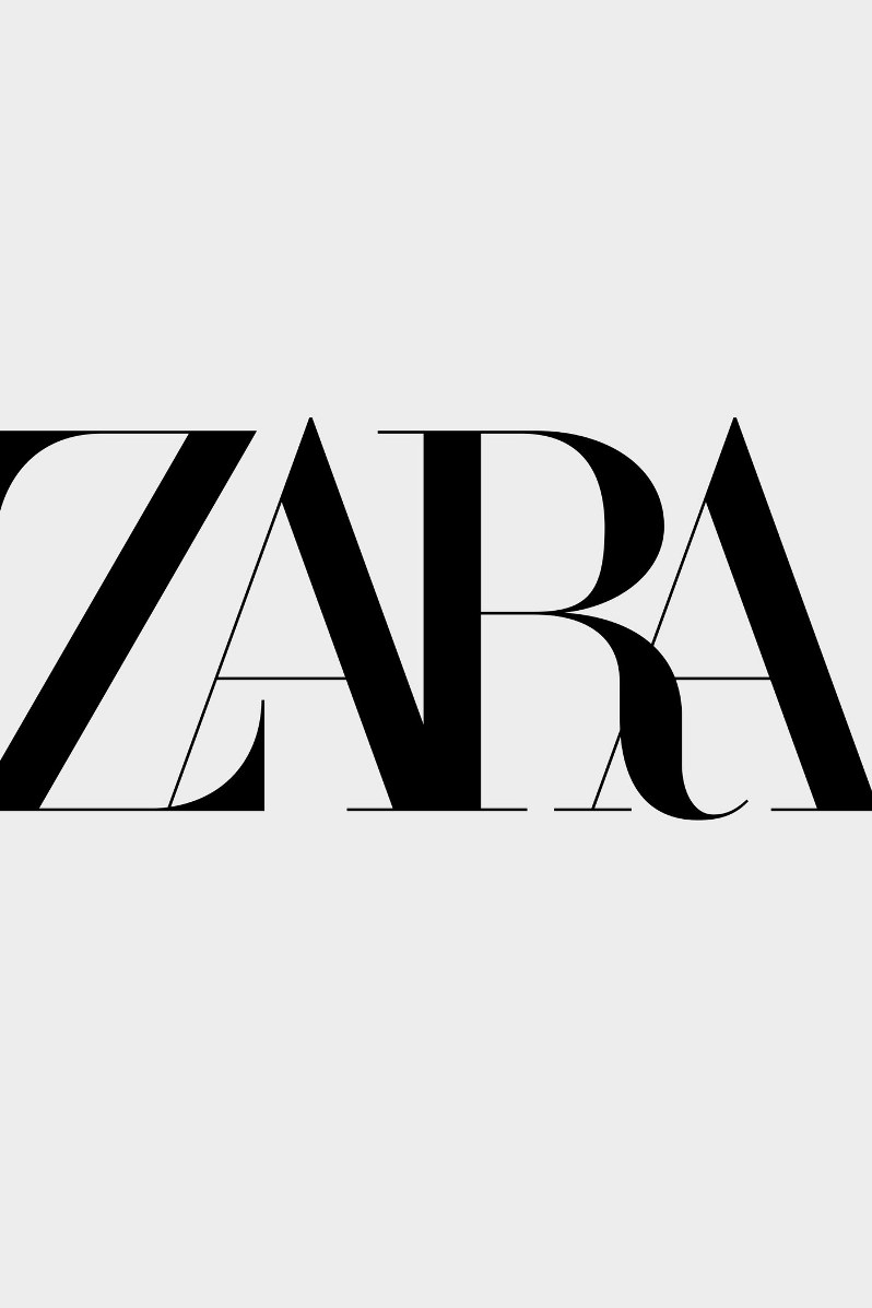
The new logo is tight-fitting with the four capitalized letters of the brand’s name in a serif font now closer together instead of standing separately as before. It was created by the design firm Baron & Baron who has designed the typography for Dior, Coach, and Bottega Veneta. This is the second logo change since the company was founded in 1975. Back in 2010, the logo was adjusted once, but so slightly that it did not stand out.
The change has however been met with a mixed response among fans and detractors. Some felt that the new logo read more like Zaba than Zara because of the squashed letters. Others draw a comparison between the Zara logo and the typography of fashion magazine ‘Harper’s Bazaar’. Some, however, came out in support of the change and felt it was a step forward for the brand.
The new Zara logo will only be for the brand’s digital use, especially on social networks such as Facebook, Instagram, and Youtube. For Zara, it appears that the new logo is a first step towards establishing itself as a brand with an independent identity among the likes of luxury fashion houses.
Follow Fashion Model Directory on Pinterest, Facebook, Linked In and Twitter!